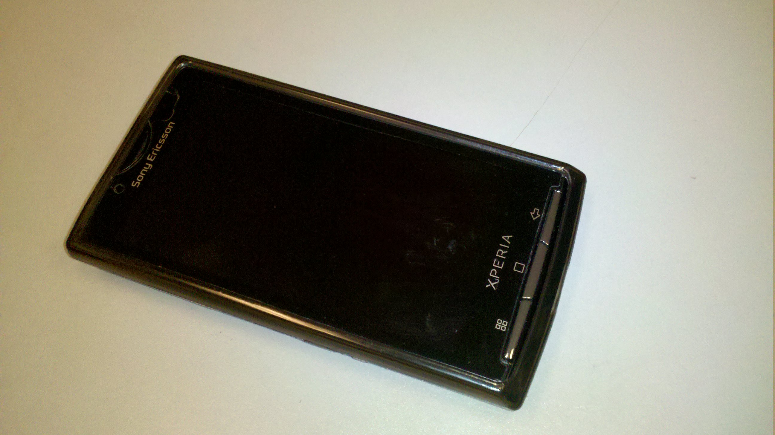
After yesterday’s big announcement that Sony’s first Android powerhouse would finally be hitting US shores on August 15th, we decided to do a full review of the X10 for all of you.
Hardware
The Xperia X10 isn’t lacking anywhere in the hardware side of the equation. With its big 4inch capacitive touch screen, 1 GHZ snapdragon processor and it’s 8.1 megapixel camera you know Sony was going to bring it hard with their first Android device.
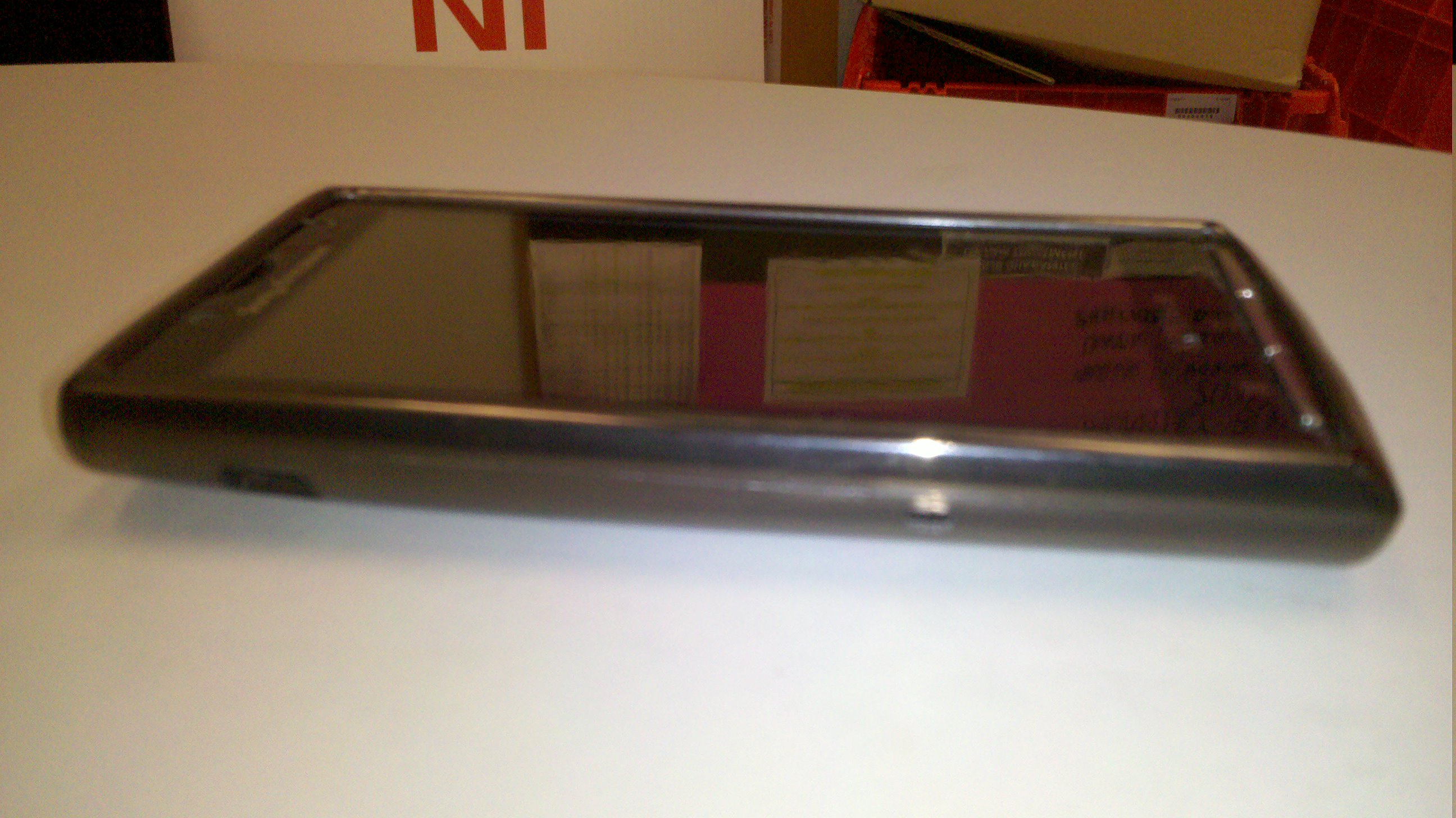
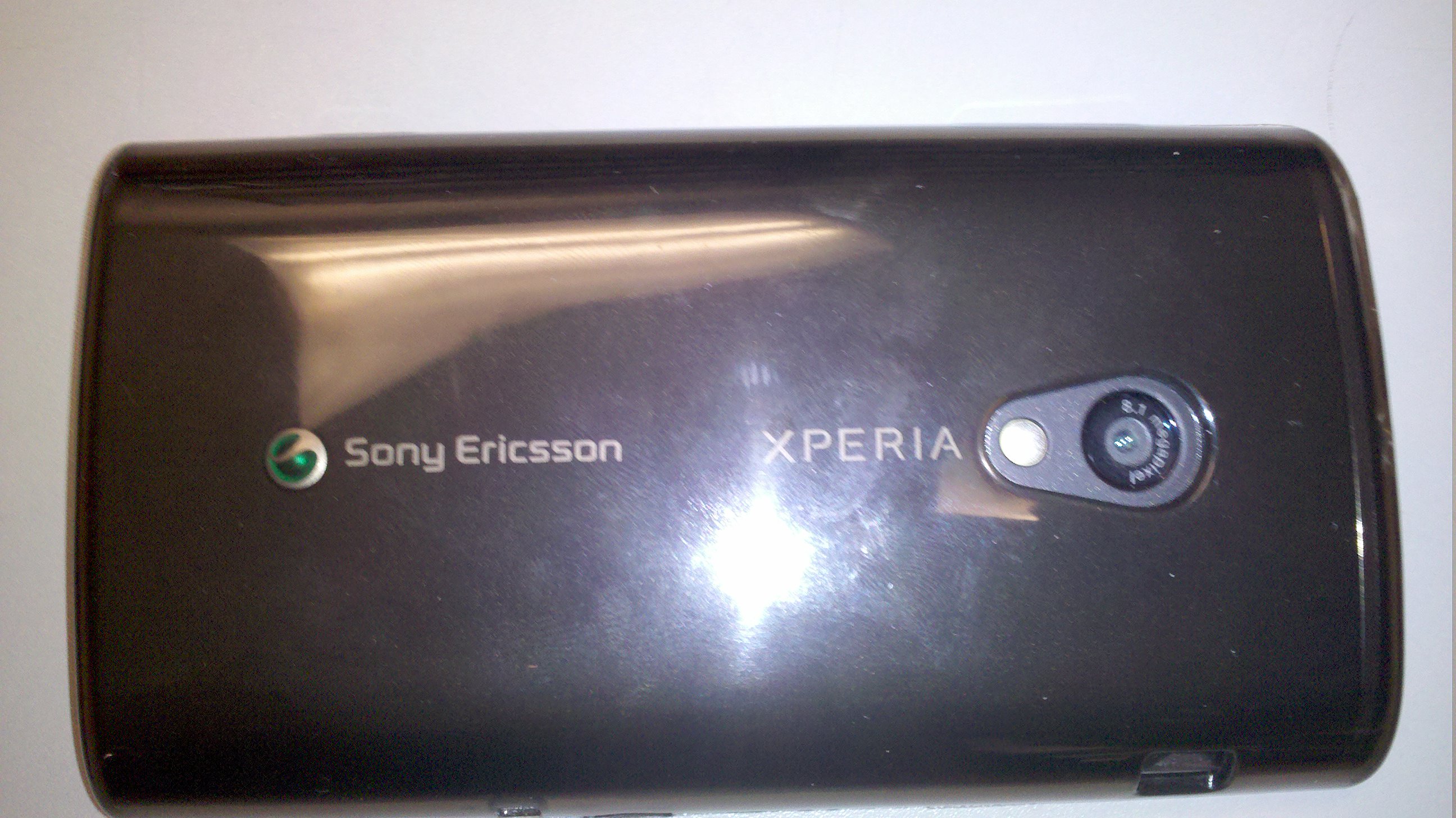
The size of the phone is very nice and is easily fits in the palm of your hand. The exterior is made of a soft brushed plastic that feels very nice to the touch but lacks the physical weight to make its presence really felt in your hand. The screen is large and crisp, 4 inches is just on the border of the perfect size, not too big for people with small hands and not too small to watch media on it.
The only drawback with the physical design of the X10 is the weight. It’s very light which is usually a good thing, but we’d say it almost borders on too light making it feel a little cheap, but besides this minor drawback we are very pleased with the design.
The capacitive screen looks very nice and crisp and responds to touch very well but suffers the same reduced visibility in the sunlight that most LCD screens do. It also has a gloss finish to it that makes viewing very nice if you’re looking at it dead on but makes the viewing angles terrible for anyone else if you’re watching a movie.
Software
Currently Sony Ericsson hasn’t released an update so this is still only running Android 1.6 with Sony’s custom Timescape and Mediascape apps running parallel. Android 1.6 by any standards is now far behind the times and the X10’s success in its upcoming launch may depend dearly on the fact of Sony getting that update complete to at LEAST 2.1 before launch.
Sony’s packed pretty much the same Android experience into this handset with the major exception of two Sony exclusive apps Timescape and Mediascape.
Timescape is a social networking/messaging/contacts viewing app that essentially takes all your contacts, links them with any social networking sites you have associated them with and will pull their pictures, updates and text messages from that person all into one spot to view them. This is all done very graphically with fancy fade ins and animations that make it very pleasing to watch. Each contact gets a tile that are stacked on top of each other as you scroll through your contacts and when you click on any person it expands to show all the information. Through our use of this app we were very pleased with the syncing of contacts and information and the idea of the app, the only problems were as you load the X10 with more and more apps you can see how much of a power hog this app really is as it slows down with little lags and jumps. On the flip side however the information loads quickly and overall there’s no complaints that we can think of.
Mediascape is the same sort of idea as Timescape. It brings all the users music, movies and pictures into one nice gallery that you can view everything through very fluidly. Again this is very graphically as all the thumbnails fly in from the sides of the screens and once again you can tell this is a power hog and pushes that Snapdragon processor to work.
There are other slight differences like the lock screen which requires you to swipe in an arc motion to unlock but pretty much we’re just looking at another android device.
Camera
Sony’s always been well known for their camera’s and how well they integrate them into their phones. This is no exception. The image quality on the pictures taken are amazing from this device, they are crisp and clear and in comparison to some other Android devices take pictures fairly quickly.
The video recording at the moment is sub HD but apparently with the 2.1 update will get 720p recording. The quality of the video recording currently is still impressive compared to other phones that record non HD quality but we’re really waiting to see what it can do once they release the update allowing HD recording.
Conclusion
All in all Sony has put together a solid Android device. They took their time and thought of most of the things they could do to try and make this phone a winner with the sharp camera, interesting exclusive apps and the overall look and feel of the device. We’d definitely recommend this phone when it launches in a few days but are reluctant to switch as presently it would mean going back to a market with no screenshots, no moving wallpapers and other fun goodies that come with 2.1.
Let’s all hope that Sony can get it together and surprise us all with a 2.1 X10 coming out of the box, because if they do we’re sure these things are going to fly. Check out a hands on video review below.
[youtube=http://www.youtube.com/watch?v=Hx-Pauxy6yw&hl=en_US&fs=1?rel=0]


