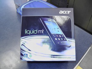
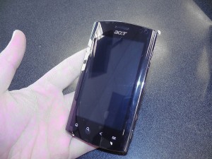
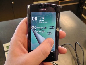
So we finally got our hands on the BRAND new Acer Liquid MT that is replacing the older Acer Liquid. Rogers has already begun selling this bad boy and from our short time with it we have to say we’re impressed.
First off, lets start with the hardware itself. The box is the same as usual, a large square-ish box that has a funky way of sliding open. This is the same as the old Acer Liquid and is what we’ve come to expect from them.
The phone itself is housed in an all metal casing that gives it a really solid feel and a nice weight. It is bubbles out on both the front and back giving a nice rounded feeling to contrast the harshness of metal which give an overall really nice feel of the phone. Our only gripe with this design is that the front LCD glass is curves as well which to us at least made it a little less sensitive to touch controls and we found ourselves having to push harder than usual on a capacitive screen.
The rest of the design of the phone is rather ordinary, a dedicated button for the camera and volume on the side, 4 touch sensitive buttons along the bottom of the screen and a lock/power on button at the top left and a headset jack on the top right.
Now what really makes this baby shine is the EXTREME customization Acer has done to the regular Android experience. It’s running 2.2 like most phones nowadays but Acer has taken the time to completely redesign the Android lock screen, home screen, widgets and pretty much every way you interact with your phone.
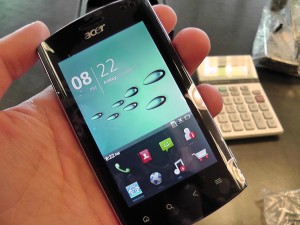
Now don’t get us wrong, everyone and their grandmother knows we are die hard Android fans here at eTechTour and LOVE the bone stock Android experience, but something Acer has done here just really shows what you can do with some real imagination.
Lets start off with the lock screen. Acer has designed it to look like a piece of paper that is folding back and you have to peel it away to unlock almost like a sticky note which is both fun and cool looking so we give them credit for that. The other interesting thing is that ALL the home screen widgets are now on your LOCKSCREEN not on the home screen. This means, all the usual widgets like clocks, alarms, weather, music players, search bars, everything you would put on your homescreen now shows on the lock screen, and you can scroll between these locked pages much like you would a regular homescreen!
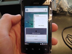
If any of the widgets are interactive, when you tap on them, it shows a small dialog box that if you slide up will enable the widget to be touched or has a cancel button for you to press if it was done by accident.
This is a cool feature and shows some definite ingenuity, I would never have thought to put the widgets on the lock screens like that. It’s nice if you’re quickly trying to look at the time or weather or something but we found it to be somewhat annoying to have to slide up to interact with anything and to lock the phone and start to unlock it again just to see our widgets.
Now the homescreens… or should I say just HOMESCREEN. That’s right, because your widgets are on your lock screen, you only have 1 homescreen. In almost an iPhone/Blackberry 6.0 style display, 8 icons are shown always on your homescreen allowing quick access to things like texting or calls or whatever you use the most. Then through a slide up motion you can access the rest of your apps in a Samsung/iPhone side scrolling pages fashion.
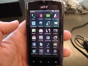
This is a neat idea but we don’t like the look of how 8 icons stay static when all the apps are display so you have scrolling apps beneath 8 non moving ones.
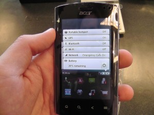
The other major thing that they have changed is the notification bar. No longer is it up at the top and accessed with a drag down motion, it now sits just above the 8 icons on your homescreen and is accessed by tapping it. This brings up your notifications like any other Android device but you also have the option of swiping sideways to access settings for things like bluetooth, wifi and other such features or swiping to the left to edit the clock and any alarms you may have.
This is a cool idea and in practice is kind of fun. The only issue we had with this was the bar is so small that you have to tap on that we found ourself often missing and having to tap multiple times just to get the notifications to show!
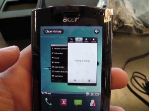
Last but not least, the other major thing that Acer has included is a recent apps history. It can be accessed by swiping to the left on the homescreen and displays as scrollable mini windows (much like windows tabs) that show the last few apps you’ve been in. This allows you to scroll through them and then tap on one to take you right back into the app.
This is probably my favorite feature of the Acer customizations, not only does it look cool, but it allows for fast switching back to things like messaging or the dialer if you quickly jumped out to use something else. It also has a quick button at the top that allows you to delete your history if you find there are too many apps shown or you just like to clean up your homescreen.
All in all we have to give it to Acer. Previous phones they added cool widgets that we really enjoyed and now they’ve gone and changed Android all around in some pretty nifty and interesting ways.
It seems that these customizations would be pushing the 800mhz processor they crammed into it fairly heavily and we wonder how well it can hold up once lots of other apps have been installed but we’re liking where Acer is headed with this design. It will definitely be interesting to see what they plan to do once Gingerbread and Honeycomb are available for all phones if these kinds of customizations will still be there or not.
If you want to grab one of these phones just head over to your local Rogers store and pick one up for a small $49.99 on a 3 year with data or a surprisingly low $399.99 with no contract.
Check out the video below for hands on with most of the features!
